The Quiet Work of Negative Space in a Painting
Negative space in a painting directs attention, sets visual pace, and changes how depicted forms relate—learn to read the open areas as active choices.
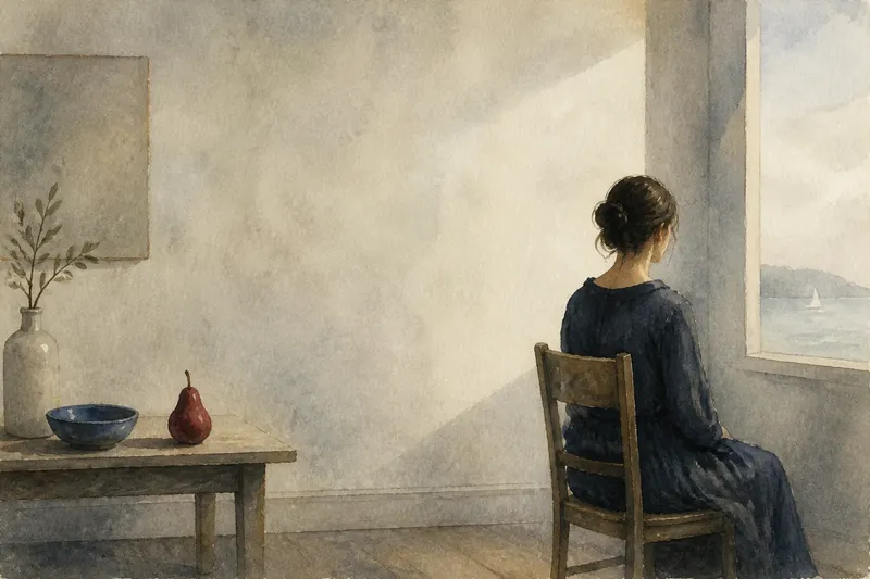
Negative space in a painting can make a small figure feel isolated, a cluster feel connected, or a bright object seem to press toward the edge. These open areas are not simply parts the artist left unfinished. Their shape, placement, and relation to painted forms guide the eye and influence how the whole composition feels.
What negative space means
In a painting, positive space is occupied by the objects, figures, and marks that attract attention as forms. Negative space is the area around and between them. The terms describe a relationship, not a ranking: the open area may be pale or dark, carefully painted or loosely handled, and every bit as important to the composition as a depicted object.
Consider a vase against a wall. The vase is easy to name, so the eye may treat it as the subject. But the wall around its neck, the narrow wedge beside its base, and the gap between its rim and the canvas edge all have shapes of their own. If those shapes are altered, the vase can seem wider, narrower, more centered, or more precarious even when its outline remains unchanged.
This is why artists often study the spaces between forms as carefully as the forms themselves. An artist may adjust a shoulder, branch, or tabletop not because the object looks wrong in isolation, but because the opening beside it has become cramped or unbalanced.
Attention through open areas
The eye does not attend to every part of a painting equally. Contrast, color, edges, and detail often draw attention, but empty-looking areas also help determine where that attention travels. A broad, quiet field can make a nearby cluster of sharp marks stand out. A narrow gap can pull the eye through a crowded arrangement, while an uninterrupted area may let the gaze pause.
Negative space can also point without resembling an arrow. When several forms lean toward the same open area, their angles may direct attention there. If a figure faces a broad stretch of blank wall, the viewer may look into that space and wonder what the figure sees or what is absent. The opening becomes part of the painting’s visual question.
Imagine a painter composing a still life with a red pear and a blue bowl on a table. If the pear sits close to the bowl, the thin gap between them can make the two objects feel linked. If the painter shifts the pear outward, leaving a broad strip of tabletop, the pear may seem more solitary and the bowl more self-contained. The expected visible change is a different sense of connection, although neither object has changed color or shape.
Space as visual pace
Open space affects how quickly a composition seems to unfold. A sequence of close-set forms can make the eye hop from one edge to the next. Larger intervals slow that movement, giving each form room to register. This is not a literal measure of time; it is a viewing rhythm created by spacing and contrast.
Repeated gaps can establish a steady beat. For example, a row of similar objects separated by comparable openings may encourage an even scan across the canvas. If one gap suddenly widens, the visual rhythm breaks. The eye may linger at the interruption, and the composition can feel quieter, more tense, or simply less regular.
The quality of the painted surface matters, too. A blank-looking field may contain subtle shifts in hue, visible brushwork, or changes in value. Such marks give the eye something to explore without competing with the main forms. A flat, even background can make the same arrangement feel more still. The difference is not that one area is “empty” and the other is “full,” but that the painter has set different conditions for looking.
Edges between forms
Negative space is easiest to overlook when the viewer names objects too quickly. Try looking instead at the contour of an opening. The space between an arm and a torso, for instance, may form a triangle. Its width and angle can make the arm appear lifted, pressed inward, or held away from the body.
These in-between shapes are sometimes called counterforms. The term is especially useful when a small adjustment to one contour changes both the object and the surrounding opening. The gap between two leaves may define their separate directions more clearly than either leaf’s internal detail. A doorway-shaped opening between figures may give their arrangement a sense of depth or separation.
Edges can be sharp, soft, or lost. A sharp boundary separates a form decisively from the space around it. A soft edge lets the two areas merge gradually, while a lost edge makes it difficult to tell where one ends and the other begins. These choices affect the relationship between forms: crisp separation can make objects feel distinct, whereas a softened boundary can make them seem to share the same atmosphere.
How to read open space?
Where does the eye pause?
Notice the largest or most uninterrupted area, then see what sits beside it. A pause may direct attention back to a nearby detail, or it may make the surrounding forms feel small and exposed.
Which gaps feel tense?
Look for narrow openings between objects and for forms that nearly touch. These gaps can create anticipation or pressure, especially when the surrounding edges point toward each other.
Does the space repeat?
Compare openings of similar size and shape across the canvas. Repetition can create order; a noticeable variation can interrupt that order and become a visual accent.
Are boundaries clearly drawn?
Follow the edges where a form meets its surroundings. A crisp outline, a softened transition, and a disappearing contour each produce a different sense of separation.
From description to interpretation
Reading negative space works best when observation comes before interpretation. First describe what you can see: “The figure has more open area in front of its face than behind its back.” Then consider what that arrangement might do: “The open area gives the figure room to look outward.” That second statement is an interpretation, not a fact about the artist’s intention.
Keep the claim tied to visible evidence. If a painting leaves broad space around a single chair, it may suggest quiet or distance, but the same arrangement could also make the chair look monumental. Check how scale, color, lighting, and edge treatment support or complicate your first impression. Negative space is one part of a composition, not a code with a fixed translation.
When you look at negative space in a painting, let your attention move between the depicted forms and the openings they create. The shifts in spacing can reveal why a composition feels balanced, crowded, open, or unsettled. Often the most telling question is not only what the painter included, but how much room the painting gives each form to exist beside what is absent.